Viewing Your Data.
Your health data is displayed in various ways across the app.
Below we will walk you through these different methods.
Data views, let's break down the components
Overview & Context
Health Dimension
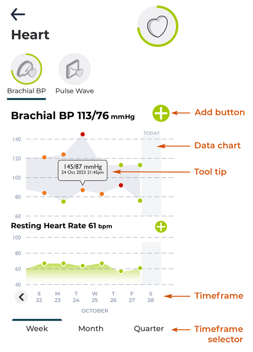
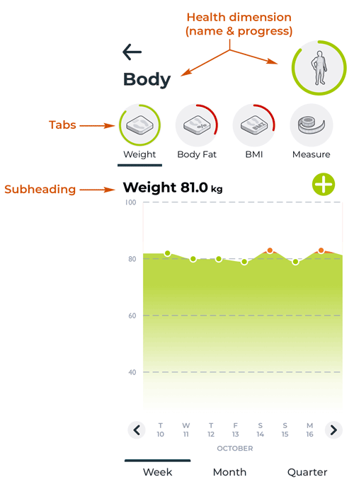
The app holds a large amount of data points. To give some structure to this data, it is grouped into the 7 major dimensions of your health - from heart to body to sleep, shown on the Health Dashboard. At the top of each data screen it shows the health dimension, both in words and with an icon. Around the icon is a progress circle, which represents the progress of the left most tab (see below). This is also the same progress that is displayed on the Health Dashboard.
Tabs
Inside each dimension, there may be multiple health datasets. For example, for Body there are four (Weight, BMI, Body Fat and Measurements). Each of these datasets has there own tab along the top of the screen and this tab is used to navigate to your desired health data. The current tab is underlined. Note that where appropriate the icon in the tab displays a progress circle, associated with your progress for that health data. For example for Weight displays your progress against your set Goal, whereas your BMI and Body Fat display your progress against clinically accepted targets.
Subheading
For each tab on this screen, there is an associated subheading. The subheading shows the most recent data reading, either entered manually or that has streamed in from a connected device or app. Refer to the Devices & Apps section for more information on how to connect your wearables or apps.
Displaying Health Data
Data Chart
The chart is where we display all your health data readings. The type of chart varies depending on the type of data displayed and in some cases this may actually be a data table.
Tool tips
By pressing on a particular health reading (coloured dot on the chart) a tool tip will pop up. This tool tip will show the actual reading itself, along with the date and time it was recorded.
Timeframe
The timeframe for the currently displayed chart is shown along the bottom of the chart. The timeframe can be one of three types: one week, one month or one quarter (i.e. three months). When the timeframe displays grey buttons, then you can press on these to move through time (left and right arrows) or drill down into detail (week ranges and months).
Timeframe selector
These buttons allow you to select your desired timeframe. The selected timeframe is underlined. If you select "Week" then the timeframe will be broken into individual days. If you select "Month" then the timeframe will be broken into weeks. If you select "Quarter" then the timeframe is broken in to months.
Add button
Whilst the vast majority of health data in the app can stream seamlessly from third party devices and apps, you also able to add health data manually. Wherever you see the Add button in the app, you can enter data.